Workeasy Software: Desktop
At Workeasy Software, I led the redesign of three core areas of the desktop platform: Reporting, Left Navigation, and Global Settings. Each had its own usability problems, and each redesign was shaped by how people actually worked, not by how the underlying system was built.
Reporting
The original Reporting experience packed everything into a multi level panel sequence, forcing users to hold too much information in view at once. I broke the flow into dedicated pages for each step, reducing the visual weight of the interface and making it far easier for users to digest information and understand what action came next. This redesign drove the new Reporting experience to a 44% adoption rate.
Left Navigation
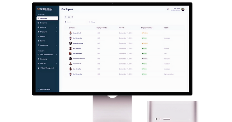
The left navigation had grown into a list of pages with no real structure, organized around how the product was built rather than how people used it. I reorganized it around the actual tasks and workflows users move through, and updated the visual design from a blocky, generic grey interface to a more sophisticated, on brand look and feel.
Global Settings
Global Settings was the most confusing part of the platform, built around engineering language and logic rather than the way real users think. I broke the settings down step by step, clarified the terminology, and restructured the flow so each action was easy to understand on its own, without assuming prior knowledge of how the system worked underneath.
Together, these three redesigns helped raise the platform's NPS from 26 to 49, giving users a desktop experience that felt considered and consistent rather than assembled piece by piece.